Best SaaS Websites: Design Examples and What You Can Learn From Them
What makes a SaaS website useful beyond its visual style? We look at Linear, Notion, Intercom and Loom to find design lessons you can apply to your own site.

TL;DR
- Make the product and its intended use understandable before asking visitors to commit.
- Show a meaningful task or workflow, rather than relying on a decorative dashboard image.
- Organise a broad offering into routes people can recognise.
- Use customer evidence that helps the buyer assess relevance, not just popularity.
- Make trial, demo and sales options reflect genuinely different next steps.
- Borrow the reasoning behind a design decision, then test it with your own audience.
It is easy to collect SaaS website references and end up with a folder full of similar-looking homepages. Big type. Product screenshots. A row of customer logos. A bright button asking you to get started.
The more useful question is what each of those elements helps someone understand.
The best SaaS websites for your reference list are the ones that solve a communication problem relevant to your product. Can a visitor explain what the software does? Find a use case that fits? See enough of the product to judge whether it is worth trying?
Here are four SaaS website design examples worth studying through that lens: Linear, Notion, Intercom and Loom. This is an editorial selection of useful patterns, not a ranking based on conversion data. Our observations refer to the public pages reviewed in October 2026; websites and their messaging change.
How we chose these B2B SaaS website examples
When people look for the best B2B SaaS websites, visual polish is often the starting point. For this selection, we looked at five more practical questions:
| Area | What we looked for |
|---|---|
| Product messaging | Can visitors identify the product’s purpose and intended audience? |
| Navigation | Are there understandable routes into a larger offering? |
| Credibility | Can visitors find customer evidence and investigate the claims? |
| Product presentation | Does the page show what using the software involves? |
| Next step | Is it clear whether an action starts a trial, requests a demo or contacts sales? |
These are design observations, not a complete accessibility, performance or usability audit. A clear-looking page can still create friction later in the journey. We have not tested the full signup flows or measured these sites’ results.
Linear: give the product a concrete role in the story
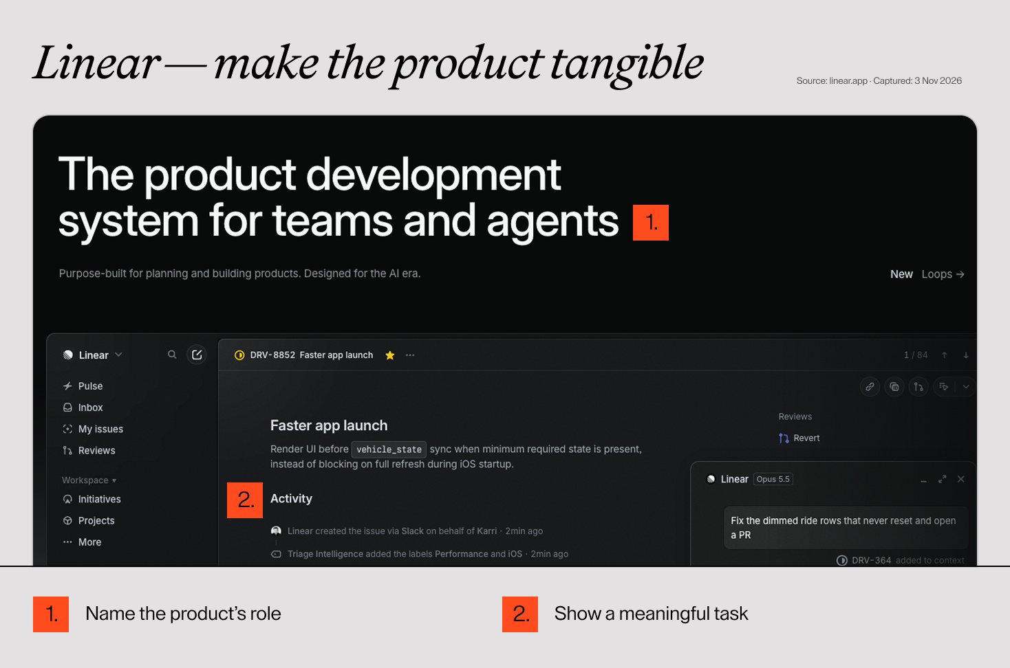
What to notice. Linear introduces itself around product development and places a detailed issue view below the main message. Further down, its content follows activities such as intake and planning. The page also provides routes to customer stories and pricing. Explore Linear’s website.
Our design reading. The product view gives the positioning something tangible to point to. Instead of asking a visitor to imagine an abstract workspace, the page presents recognisable work: an issue, its context and its progress. The surrounding narrative then gives the interface a purpose.
What to apply. Choose one task your buyer cares about and show enough of the interface to explain it. A screenshot should answer a question: what is happening, who is doing it and what changes as a result? Use a short caption if the answer is not obvious.
What to watch. A dense interface can be convincing to an experienced buyer and confusing to a newcomer. Do not shrink an entire dashboard until none of its meaning survives on mobile. Select a relevant detail and keep the wider context available elsewhere.
Notion: give a broad product a few clear entry points
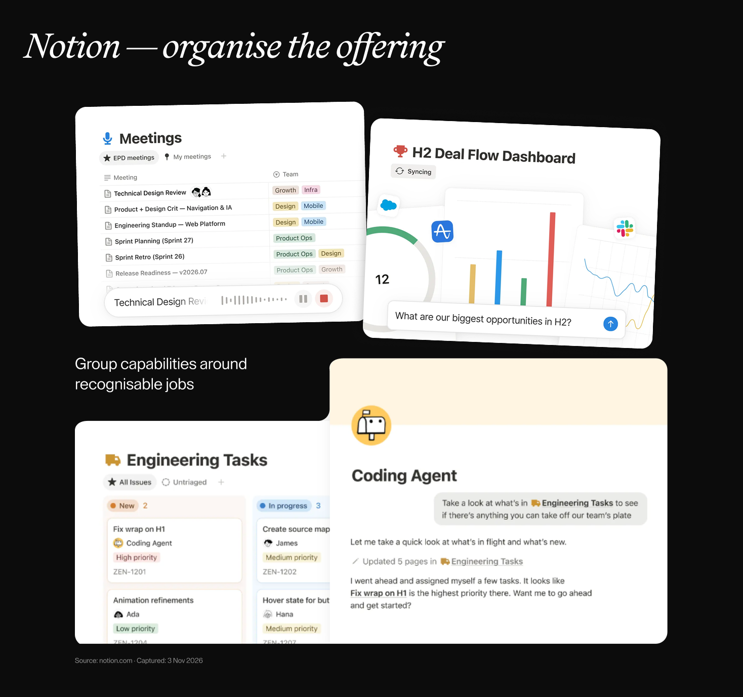
What to notice. Notion groups its offering around capturing information, finding answers and automating work. Its homepage includes practical use cases, named customer testimonials and separate free-start and demo options. Explore Notion’s website.
Our design reading. Grouping helps establish a first layer of understanding before the visitor has to explore individual capabilities. Named customer voices add another kind of information: who is speaking about the product, rather than a claim made only by the vendor.
What to apply. If your product serves several needs, organise the first navigation layer around a small set of understandable jobs. Then let visitors explore the detail that matters to them. For proof, choose a customer story with a situation your buyer recognises, and link to more context where it exists.
What to watch. An umbrella message can become so broad that an unfamiliar visitor cannot identify the product category. Pair it with a concrete explanation or demonstration. A familiar brand has context that your new product may still need to establish.
Have a project in mind?
Let’s talk
Intercom: make different levels of commitment visible
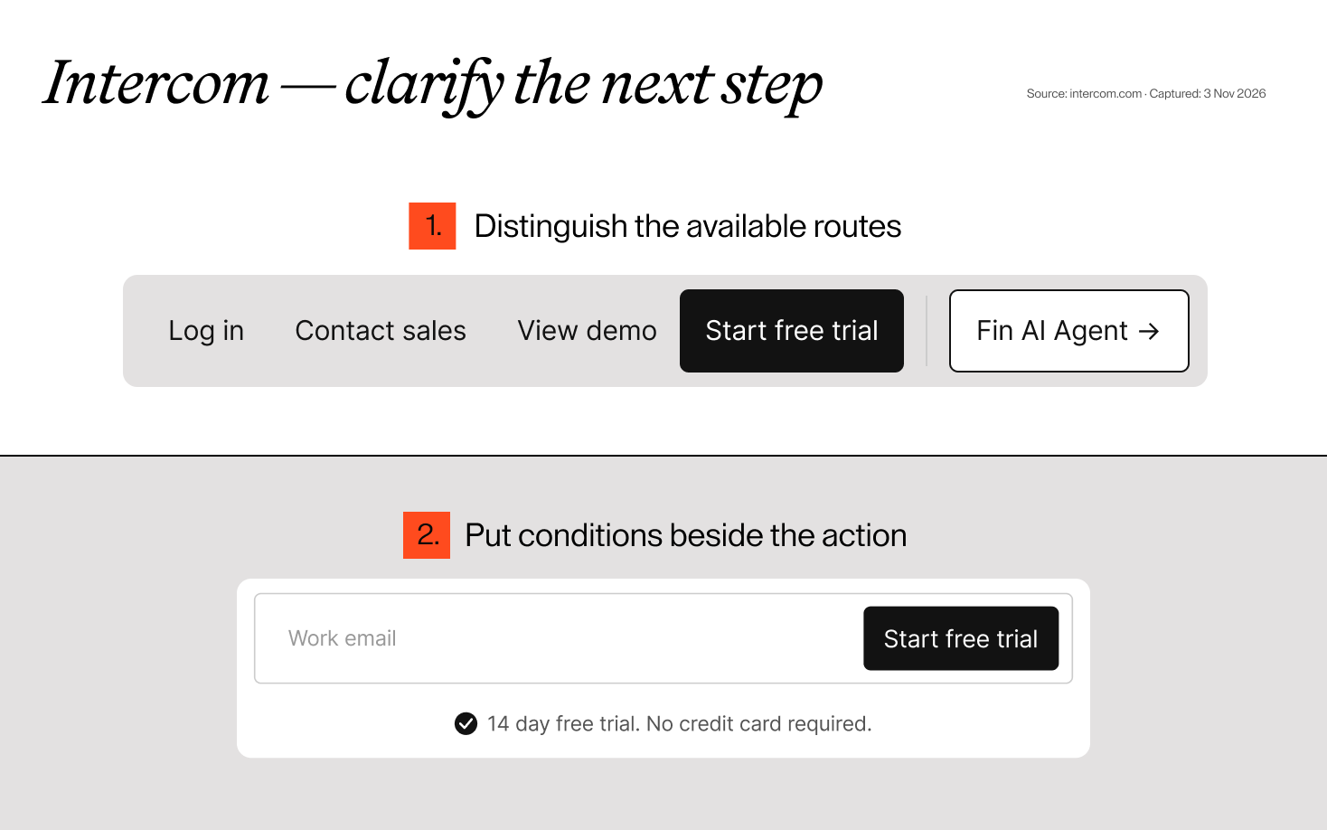
What to notice. Intercom’s homepage presents its helpdesk and AI agent together, supported by interface examples. The navigation offers a trial, a demo and contact with sales; trial conditions appear near the hero form. Explore Intercom’s website.
Our design reading. Those labels acknowledge that visitors may arrive with different intentions. Someone ready to try the software needs a different route from someone who wants to see it explained or discuss a business requirement. Nearby conditions help clarify what starting involves.
What to apply. Define what each CTA promises before deciding how many buttons to display. If “demo” means a sales meeting, say so at the next step. If it means an on-demand walkthrough, make that clear. Keep important requirements close to the action that creates the commitment.
What to watch. More options can also create more competition. Decide which action should lead on each page, make the alternatives visually secondary and verify that the destination matches the label. The presence of a demo link alone tells us nothing about the friction after it is clicked.
Loom: explain the core action before expanding the feature list
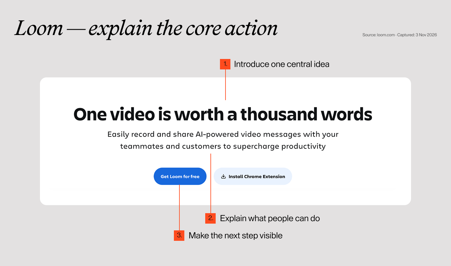
What to notice. Loom introduces video messaging with a short headline and a supporting explanation about recording and sharing. Further down, the page expands into editing, sharing and team-specific uses. A free-start action is prominent in the first screen. Explore Loom’s website.
Our design reading. The opening gives the visitor a manageable idea before introducing more capabilities. The page can then add depth without asking someone to understand the entire feature set at once.
What to apply. Write a plain-language sentence explaining the central action your product enables. Use it to evaluate your hero: can a new visitor recover that meaning from the headline, supporting copy and visual together? Add specialised capabilities where they answer the next question.
What to watch. A memorable headline still needs a useful explanation. If the product solves a complex or unfamiliar problem, simplify the sequence of information without removing the details a buyer needs. Brevity is helpful when it preserves meaning.
Turn inspiration into decisions for your own website
A useful reference should help you write a better brief. “We like this website” is a start. “We need visitors to understand this workflow before they request a demo” gives the team a design problem to solve.
Use these questions when reviewing your own pages:
| Question | What to prepare |
|---|---|
| What must a first-time visitor understand? | A clear product category, intended user and central use case |
| What should the product visual explain? | One meaningful task, with realistic content and enough context |
| How will different buyers find their route? | Navigation labels and page groupings based on their questions |
| What makes our claims believable? | Relevant customer stories, attributable quotes or verifiable examples |
| What happens after the CTA? | A defined destination, requirements and clear expectations |
| What needs checking on mobile? | Readability, visual sequence, controls and the complete next-step journey |
Start with the question your current site leaves unanswered. You may need a clearer product explanation, more relevant proof or a simpler route to evaluation. Adding another animation will not automatically solve any of those.
Treat the proposed change as something to test. Ask people from your audience to explain the product in their own words, find information for a realistic buying decision and describe what they expect after clicking the main CTA. Their answers are more useful than whether they like the colour palette.
What these examples do not tell you
A public homepage does not reveal the team’s research, experiment results or commercial performance. Customer statements about a software product also do not prove that its website design caused those outcomes.
That is why this selection focuses on visible decisions and the reasoning we can draw from them. The lesson to carry into your own project is to connect the message, product evidence and next step around a real visitor need.
If you are planning a SaaS website, tell us what your product does and where people get stuck. We can help shape a clearer way to explain it and guide visitors towards the right next step.
FAQ
Should a SaaS homepage show the actual product?
Show enough to help visitors understand a meaningful task. Realistic interface content often provides useful context, but a full dashboard is not always the clearest format. A focused detail, short walkthrough or explanatory sequence may communicate more effectively.
Should the main CTA be a free trial or a demo?
Choose based on how buyers can evaluate your product. If useful evaluation requires setup, data or guidance, a conversation may be a better starting point. If visitors can reach value independently, a self-service route may fit. Make the actual commitment clear and test the journey.
How much customer proof do we need?
Enough relevant evidence to address the buyer’s uncertainty. A contextual story can answer questions a logo cannot. Use permissioned, accurate material and make clear whose experience is being described. Do not invent metrics to make the section look more convincing.
Can we combine ideas from several SaaS websites?
Yes, provided they support one coherent story. Decide what each borrowed principle solves, then adapt it to your audience, product and brand. Combining unrelated visual styles can create more work without making the product easier to understand.